

Project Details
As part of a one-week accelerated user experience design class, I was tasked with executing the UX design process to translate user wants and needs into an intuitive digital experience. The following case study showcases the process I was able to accomplish.
Unsure of what I wanted my product to be, I started off with a gut instinct to tackle a pretty universal problem.


Discovery


User Research
As a first step, I conducted interviews with professional women to understand the most important factors in the success of meal planning and nutrition tracking, and to discover what their pain points and road blocks are in the experience.
I surveyed a variety of other meal planning and nutrition tracking sites, apps, and services as a competitive analysis to compare best practices and compile a feature inventory.
And beyond competitors, I also looked at other productivity tools and healthy lifestyle products and brands to compare the tone, visuals, and voice.
Personas
The user interviews and affinity mapping synthesized the qualitative data and led to several insights and themes that I developed into a persona. Ideally, additional personas would be created to help define a more well-rounded user-base, but for the limited time of this project, I used the persona of Catherine to inform user flows and task scenarios.
Competitive Analysis & Observations

Positive
There are numerous options for meal planning apps to support you in your meal planning and nutrition tracking/weight loss journey — all of which have different features and options.
Negative
Function over form
Lacking content/voice to encourage discovery, interaction, incentives to prevent burnout/dropoff
Lacking automation of nutrition data from recipe info to nutritional logs
All this research pointed out specific pain points and opportunities to create a robust tool to better empower busy, professional adults to not only incorporate healthy living into their lifestyles, but to truly benefit from and monitor their health and nutrition goals. This led to a revised problem statement to drive the outcomes of this product.

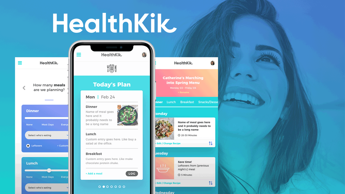
The Solution

A responsive site to help plan meals and automate nutrition tracking based on our persona’s busy life and need to access the product at home and on the go.
For the sake of time, I designed the mobile view first based on the insight that most users would access the site’s day-to-day features on their phones.

Ideation
Sitemap & User Flow
A sitemap was created to represent the structure of the information architecture and basic content in order to show how the pages related to each other. Then, based on a specific task scenario, I built a user flow for our persona to generate a new meal plan.


Sketching & Wireframing
After brainstorming, I began sketching and refining paper prototypes to get an idea of what the experience would be to generate a new meal plan. This allowed me to put into practice the familiar UI patterns from the research to create a simple, intuitive flow that felt modern, efficient and approachable.


Testing & Iterations
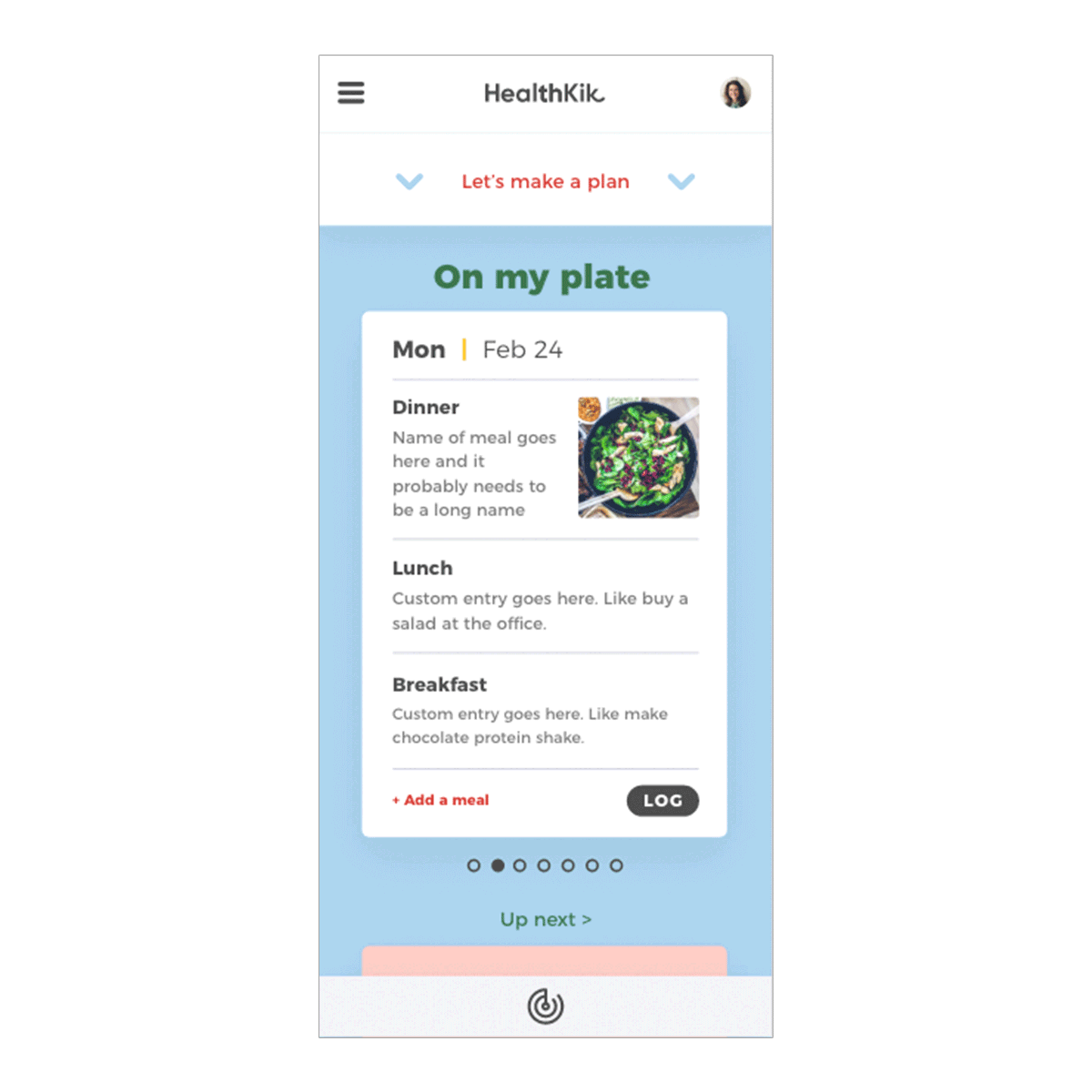
From there my sketches came to digital life with grayscale wireframes to continue the user interface design and layouts. In usability testing during the transition from sketching to wireframes, I came to a pivot moment in the design.
While the meal planning is a huge feature, the day to day interactions on the user home page would likely be more of a “What’s on my plate today” view of the current plan you’re on.
I adjusted user “Home” to minimize the “Let’s make a plan feature” and highlight the day’s meal plan to better reflect the needs of the user.


UI Design
After testing and iterating wireframes, it was time for the real fun – the final design. From user interviews and competitor research, I created a vibrant and energetic color palette for unique brand recognition to stand out amongst the typical meal planners and nutrition trackers. The streamlined and simple interface utilizes the bright palette to motivate and encourage users, without conflicting with the photos of the recipes in the meal plan.
The pages are designed to be very clean and minimal where decisions need to be made to alleviate stress and add a helpful personality and charm. And, when meal plans and recipes are generated and highlighted, a robust set of features allows the user the option to customize, organize, and share with ease and efficiency.

Usability
When tested, users had a very positive response to the design, and overall the immediate sentiment reflected vibrant and energized feelings. Small tweaks were also made to the language and layouts based on user feedback to ensure a smooth user flow and understanding of the information hierarchy.
Several color palettes were tested to gauge user sentiment and reaction. Users overwhelmingly chose the bright vibrant colors over more muted and calm color palettes.
User testing also led to small, subtle changes in the layout to clarify the labels and provide a quicker, more immediate read of the content and actions.
The Results

Annotated Task Scenario:
Generate a new plan


Product Differentiator
Automation & Visualization


User-Centeric Features
Improves efficiency and promotes sustained use

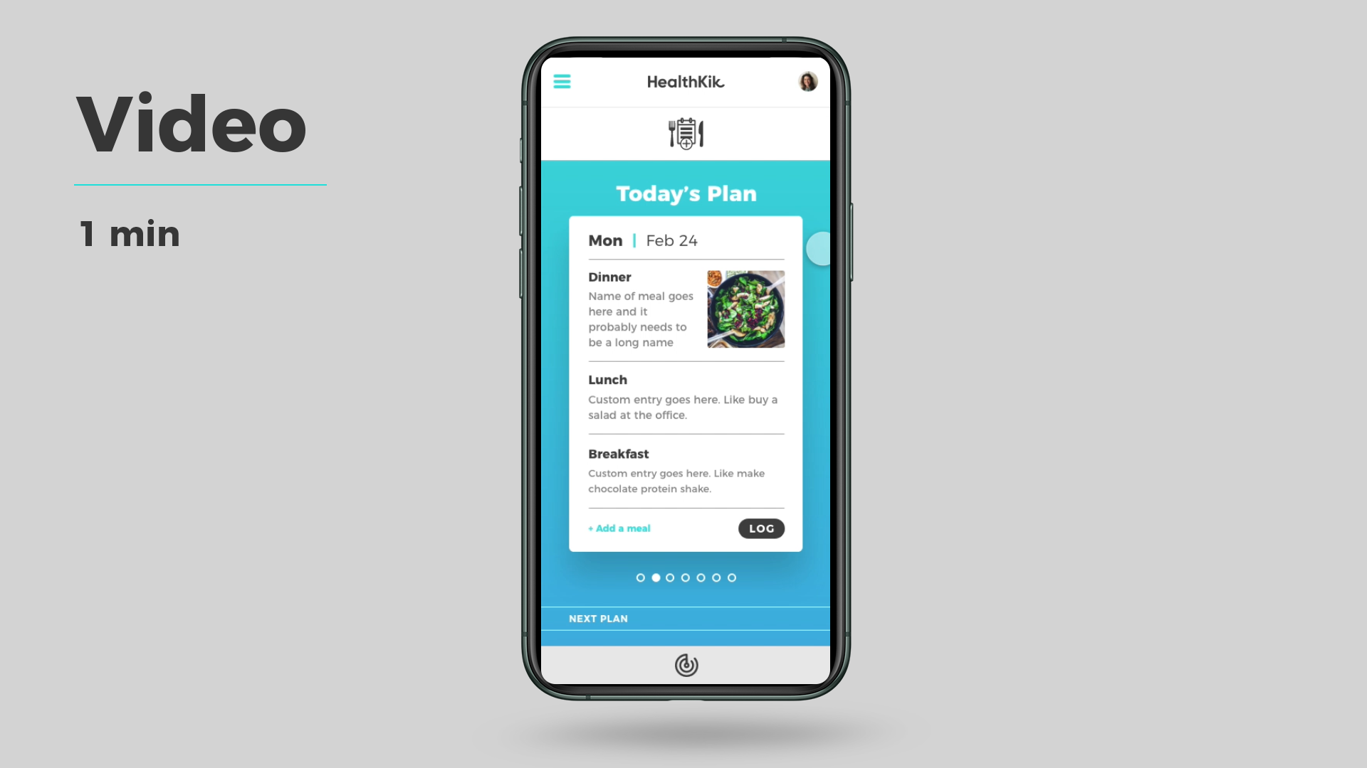
High-Fidelity Prototype
The Big Takeaway
After a very fast week, the results of Healthkik were pretty clear — this project was the perfect marriage of my love of design, branding, and marketing in a digital user experience setting. I feel I only scratched the surface of exploring actions, features, and content for this fun, useful product.
Next steps?
Research and develop additional personas, user flows, content strategy, etc.
Flesh out the desktop and app versions.
Who has some capital? Because I want this product.
Let’s go!
